ByJohn A
Choosing Best Colour for Room Without Getting Room Colour Combination Wrong
Colour does things quietly. The room that never quite feels settled, the space that reads smaller than its actual dimensions, the bedroom that leaves you vaguely restless even after a full night of sleep. Nothing obviously wrong. Just not right. Most people go looking at furniture, lighting, curtains. The answer is almost always the walls. Colour works on you constantly, just below the level where you consciously register it, which is exactly why picking it deserves far more thought than it usually gets.
Choosing the best colour for room isn’t an aesthetic exercise as much as it’s a spatial one. The light, the proportions, ceiling height, what the room is actually used for, when it sees the most activity through the day. All of these shape what a colour does on the wall rather than what it appears to do on a swatch card. Get it right and the room feels complete without you being able to say exactly why.
Get it wrong and it’s quietly, persistently off.
Why the Same Colour Feels Different in Every Room
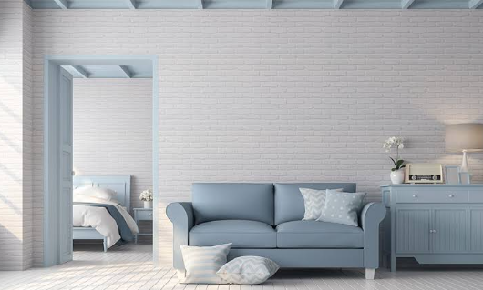
Warm tones advance. Cool tones recede. A room colour combination that feels expansive and welcoming in a large, south-facing drawing room can make a similar-sized bedroom feel closed in. Ceiling height plays into it. The colours visible through adjacent doorways play into it. Nothing in a room is ever experienced in isolation and that’s exactly the part most colour decisions miss entirely.
The best colour for room decision has to start with understanding the actual room, not with what looks good on a mood board.
See also: What Are the Latest Advancements in Vape Technology?
Undertones Do Most of the Work
Every colour has an undertone hiding inside it and it behaves very differently depending on the light. That white which looked clean and neutral at the showroom? It might carry a blue undertone that reads crisp in afternoon daylight and genuinely cold under warm lamps by evening. A greige that felt grounded and warm might lean distinctly pink in a sun-drenched room by noon. Turns out the colour you chose is never really just that colour.
The room colour combination falls apart here more often than anywhere else. Not because the wrong colours were chosen, but because what those colours actually contained wasn’t really considered. Warm undertones tend to stabilise across shifting light conditions. Cool ones shift more noticeably. Testing on the actual wall at different times of day, not a small swatch tacked to a corner, is one of those steps that feels excessive right until it saves you from repainting.
Which Way Your Room Faces Actually Matters
The orientation of a room changes what colour temperature feels like inside it. North-facing rooms live in indirect, cooler light all day. Put a cool-toned colour in there and the walls will consistently feel flat, a bit washed out. South-facing rooms have enough warmth coming in to carry cooler hues without them going cold.
The best colour for room in each of these situations is genuinely, meaningfully different. Paint also dries slightly darker than the wet swatch, which most people only discover after it’s too late. Testing in actual room conditions before committing isn’t being overcautious. It’s just the right order to do things.
Where JK Maxx Paints Gets It Right
Even the most carefully chosen room colour combination is only as good as the paint carrying it. Cheaper products drift over time, dulling or picking up odd tints until the walls no longer look like what was chosen. Majesta Tru-shyn from JK Maxx Paints is built specifically against this. P.U.R.A technology gives it real film strength, keeping that Luxe Sheen intact years after application rather than going flat. Crack Shield Tech handles the hairline breaks that slowly compromise any finish. A twelve-year warranty says something real about how it’s made.
For rooms that get used hard, WipEazy Duo+ handles everyday reality well. ScuffGuard Technology and Advanced Stain Guard Tech mean the best colour for room that went up still looks like that colour two years later, not a worn, faded version of it. The Rich Matt Interior finish and excellent washability make it genuinely practical without taking anything away from how the walls actually look.
Look at the Room, Then Choose the Colour
The right room colour combination tends to become obvious once you actually study the space rather than just measure it. Test on walls. Sit with it through different light. A colour that genuinely works in a room is unmistakable when you see it properly. The goal was never finding a colour that looks impressive everywhere. It’s finding the one that works exactly here.